
1The Amul Story
Amul, one of India’s most well-known dairy cooperatives, based at Anand in the state of Gujarat, India, was formed in 1946. Today, it is a brand managed by Gujarat Co-operative Milk Marketing Federation Ltd. (GCMMF), which in turn is jointly owned by 3.6 million milk producers in Gujarat.
The brand spurred India’s White Revolution, making the country the world’s largest producer of milk and milk products. In the process Amul became the largest food brand in India and has ventured into markets overseas.
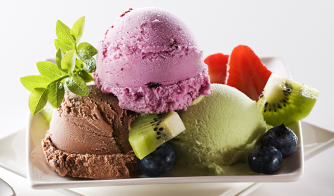
Keeping up with the latest trends, Amul has started offering superior quality and delicious ice creams, sundaes, shakes and other ice cream concoctions to consumers in specialized Ice Cream Scooping Parlours spread across India.
It currently has parlours in major cities including Mumbai, Chennai, Delhi, Bengaluru, Thane, Pune, Kolkata, Nagpur, Ahmedabad and Coimbatore.
2Scope of Work
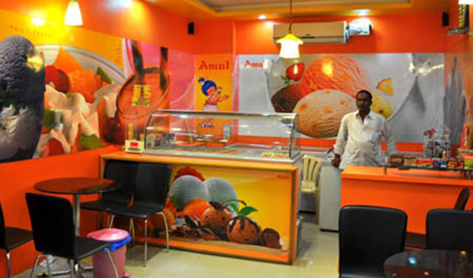
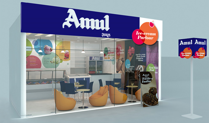
Although Amul boasts an extensive chain of ice-cream parlours, there is a distinctively visible drawback – the parlours hint at a traditional, outmoded appearance.
Amul entrusted independent,s trategic, brand design consultancy, WOW Design with the task of designing a contemporary brand style and structural design for its scooping parlours.
3Approach
Recently, international ice cream brands have broadened their presence with contemporary branding and exemplary structure designs in the ever competitive Indian market. Likewise, major national brands like Amul have aimed for contemporization.
The existing Amul Scooping Parlours had a wide scope for enhancement with regards to brand identity, design style and structure design. Creating an experiential value was essential not just for the pull factor but also to entice the consumer for spending some time in the parlour.
Also the existing colour scheme and interiors required a re-think. Hence it was necessary to create an appealing design language and structure for a strong recall value.
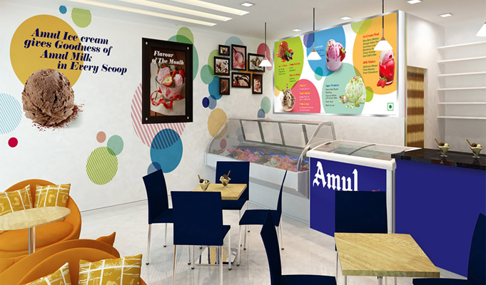
4Visual Design
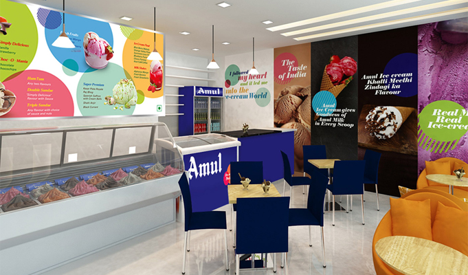
A visually arresting design language was executed for the parlour to establish a connect with the audience from all age groups. It incorporated a cool and inviting ambience, which perfectly befitted the impulse category.
The styling of the interiors was accomplished through wall branding exclusively with captivating ice cream drool shots and balancing it perfectly with supporting copy to extend the tempt factor.
Spherical shapes inspired from the shape of a scoop were introduced as an ownable element. The interiors were further aesthetically complimented by suitable décor that went along with the overall theme. The colour cues inclusive of blue and white were adopted from the colour scheme consistently used by Amul in its retail branding.


